Some visualisations from the US site Visual Economics. http://www.visualeconomics.com
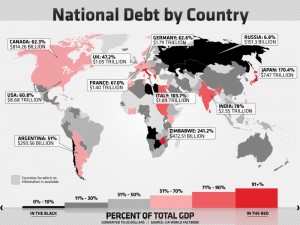
GDP vs national debt by country
http://www.visualeconomics.com/gdp-vs-national-debt-by-country/
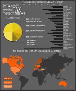
How wealthy countries tax their citizens
http://www.visualeconomics.com/how-do-wealthy-countries-tax-citizens/
From Catherine Mulbrandon at http://www.visualizingeconomics.com/
Tagline: ‘making the invisible hand visible’
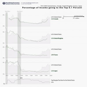
Percentage of income going to the top 0.1 percent in five countries 1913-2004
http://www.visualizingeconomics.com/2007/03/14/comparing-income-of-top-01-percent-in-five-countries/
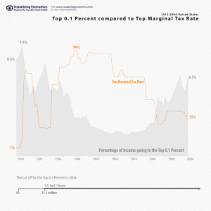
US Income of Top 0.1 Percent vs Marginal Tax Rate
http://www.visualizingeconomics.com/2007/03/24/us-income-of-top-01-percent-vs-marginal-tax-rate/
Joss Winn recently posted a selection of economic data visualisations, including most of these. Check out the full set


